yillx

yillx
HTML5

n 2004, the introduction of HTML5 also brought us the JavaScript based drawing method Canvas. The vector-based SVG format has been a thing since 2001. However, it only became truly successful over the past few years, in parallel to HTML5. Both formats have their advantages and disadvantages. But which of the two is the better choice for which situation? Where are their strengths and weak points?
JavaScript vs. XML-Syntax
The biggest difference between HTML5 Canvas and SVG is the markup, or rather, the coding. Ultimately, only a single element (“<canvas>”) is being marked up via HTML5. The entire content of the canvas is realized via JavaScript.
According methods allow you to draw and combine shapes like rectangles, circles, but also complex polygons and arcs. JavaScript is also used for the looks (fill color, as well as stroke and stroke color).
var canvas = document.getElementById("canvas");
var drawing = canvas.getContext("2d");
drawing.moveTo(0, 0);
drawing.lineTo(200, 200);
drawing.lineWidth = 2;
drawing.strokeStyle = "red";
drawing.stroke();
In the example, a red line is drawn from the position “0, 0” to “200, 200”.
Via SVG, the same line would be drawn using an according SVG element.
<line x1="0" y1="0" x2="200" y2="200" stroke-width="2" stroke="red" />
Although the result is identical in both cases, you can tell that the SVG variant is significantly shorter, and, due to the XML syntax, the markup should be a lot more intuitive for most people.
Another advantage of the SVG format is that the design can also be done via CSS. Here, individual shapes can be designed uniformly via ID or category.
So, when it comes to the markup, the SVG format is ahead. It saves space and has a simpler syntax. With HTML5 Canvas, the cards are stacked against those that generally want to provide all of their content without JavaScript as it is.
Pixel vs. Vectors
Another significant difference is the way the formats display content. While HTML5 Canvas is a pixel based format (a PNG image is created within the browser), the SVG format is vector based.
Of course, HTML5 Canvas also allows you to create graphics for high-resolution displays. But, at the latest, after zooming in, the Canvas drawings become pixelated, while SVG drawings keep their acuity.
Once again, the SVG format stays in the lead – especially since you can even integrate bitmaps within an SVG document.
Interactions and Effects
As the SVG format also supports CSS, all stylesheets options are available to you. Aside from simple designs, it is also possible to implement interactive effects.
This way, you get to apply hover effects to individual SVG shapes, highlighting them, changing their color, or enhancing them when hovering over them with the mouse. This allows for animations as well, thanks to the “transition” feature.
Since the SVG format supports links, you can add references to shapes, creating links from individual shapes.
On top of that, users get to address and manipulate SVG elements via JavaScript.
document.getElementsByTagName("rect")[0].setAttribute("width", "200");
In the example, an SVG rectangle is being manipulated using JavaScript.
Speed
A final big difference between HTML5 Canvas and SVG is the speed, regarding the rendering, and display of drawings in the browser. In general, no format is ahead of the other here.
You could definitely neglect the speed difference when it comes to less intricate drawings. For complex or large designs, however, the differences become evident.
With an increasing number of objects – both simple shapes and complex paths – the SVG format slows down. It takes longer to render and display the drawing. The Canvas format does a lot better here. The more objects are placed in the drawing; the more performant HTML5 Canvas becomes in comparison to SVG.
Things look different when considering the size of the area. The SVG format does a much better job at handling large areas, and on there, it renders elements much faster than the Canvas format.
Thus, the SVG format should be your format of choice when you want to use large format drawings, maybe even page-filling ones. Those that need to render exceptionally complex elements, however, are better off using the Canvas format.
Pixel Manipulation
Since only HTML5 Canvas is a pixel-based format, pixel manipulation is mostly out of the picture when it comes to SVG as it is. However, even the SVG format gives you the option to use different filters to manipulate the color of an implemented bitmap, for example.
Overall, HTML5 Canvas is a better choice for pixel manipulation. The pixel-based format makes it rather easy to alter every single pixel of an image using the according function.
This allows for the realization of both static manipulations, and animated effects. With HTML5 Canvas, even real-time manipulation of videos is possible.
For instance, the color in a video (via the green screen method, for can be replaced by another color, or background image dynamically. Here, use JavaScript to access the frames of a video, replacing one color with a different image, for example.
Conclusion
The listed examples prove that both HTML5 Canvas and the SVG formats have their advantages and disadvantages. When it comes to the combination of different possibilities that we presented here, you may need to ponder which format is the better choice.
In general, the following can be said, though: when it comes to static drawings, with the primary focus being scalability and the display on large surfaces, the SVG format is the right choice.
For intricate depictions that need to be recalculated permanently – real time data of a weather map or a video, for instance -, HTML5 Canvas is more performant, making it the superior choice.
presentations
n the past, this was out of the question: presentations wer

done at the client’s place or in your office space. Duringstudies, I learned how to glue printed drafts to cardboard, to show them during presentations. Even web layouts were printed and presented that way. Nowadays, the ways, and options, of presentation have changed. By now, thanks to the internet, a presentation can also be done when you’re separated from the customer both spatially, and time-wise.
Presentation on Location: Elaborate and Time-Consuming
Nobody will present a web layout on a traditional presentation board anymore. It takes at least a projector and a canvas to show a website in front of, possibly multiple clients.
This way of presenting is connected to a certain effort. A date with all participants available has to be determined. Technology needs to be prepared, and, obviously, the presentation itself takes up time as well.
Naturally, it’s very tempting to just send out a presentation as a PDF, or the link to the website prototype via email. This way, the client gets to look at the draft for as long as he wants, as well as read through provided comments or explanations.
Especially those that don’t consider themselves to be great speakers and convincers may prefer this type of presentation. Not only because it saves time, and possibly takes less effort. You also avoid the alleged danger of a poor “performance.”
Don’t Underestimate Direct Contact
Nonetheless, an internet presentation – whether it’s an email with a PDF attachment or a simple link – comes with big risks. While you as the designer or developer wait on the client’s reply, you have no influence on how the blueprint is perceived.
You are unable to immediately address criticism and open questions. Often, a draft is handed over to a colleague, asking them for their impression. Family members and friends are also a popular way to get input on the draft. In the end, about a dozen of people may have seen and thought about your draft. In a lot of cases, the general opinion will be more on the negative side.
That’s because designers and developers focus on usability, target audience, and other objective aspects, while clients – and all other people that saw the outline – decide with a simple, personal “like” or “dislike.”
Presenting on site, however, allows you to address criticism and questions right away. Ambiguities can be removed quickly, or don’t even come up. Suggestions for changes are another thing you get to react to instantly.
Client-sided suggestions for changes and improvements are often a delicate topic. Not every suggestion works for the client. In a personal conversation, these proposals can be turned down, and explained easier.
Even Presentation Grouches Should Present On Location
Although it seems simple to forgo an on-site presentation, even presentation grouches should swallow the seemingly bitter pill. Even with the best ideas, you’ll often have to convince people first. The best way to do so is personal and direct. You don’t need to be a rhetorical expert to do so. If you’re convinced of your work, you should be able to show this to your client.
Cards with keywords or small PowerPoint presentations help you to not get off track during a speech.
When Email Presentations Make Sense
Although on-site presentations are sensible and necessary in many cases, of course, there are plenty of situations where an email presentation is entirely fine. If the design and realization have already been discussed, or even determined, the risk of general criticism that has to be addressed right away is low.
Here, there’s no reason to send intermediate results or a finished project to your client. There’s nothing wrong with the email route when it comes to small projects with the effort of an on-site presentation bearing no relation to the budget.
In any case, with an email presentation, you should always ask for questions or ambiguities, to be able to react to them as soon as possible.
Combination of On-Site and Internet Presentations
Especially with big projects, one presentation won’t always do the trick. Between the presentation of the layout, concept, and the final presentation, it makes sense to show the client intermediate steps as well, to get their permission.
Here, you don’t always have to set up an on location presentation. To solve a bunch of details that come up in larger projects, it is recommended to use tools that ease the workflow of these projects.
Web applications like “Live Capture” by InVision and Diigo allow you to upload drafts, and seek feedback. Here, it’s possible to draw on the drafts, as well as place comments directly within the draft.
Even in larger teams, it is feasible to answer any questions, and any design or concept errors can be determined. Thanks to these tools, this is very uncomplicated and faster than trying to solve all these issues via email or phone.
Conclusion
In general, an email can rarely replace a personal presentation. Instead, digital forms of presentation should mainly be used as additional means of cooperation, to lead a project to its successful end
Logomak

all starts with a brand’s name. But this alone doesn’t do much. The web app Logomak helps you find the fitting font, as well as an appropriate color scheme. Plus, it shows you successful logos of competitors in the chosen branch for your inspiration.
I don’t know your way of approaching this. Personally, when it comes to logo design, I like to click around and get some inspiration. Aside from the essentials, logo design is a creative process that shouldn’t only take place at the drawing board.
This is where a service like the free Logomak comes in very handy. Logomak has a rather empirical approach to the process but leaves a fair share for your creativity. With Logomak, you’ll get to a suggestion in a few steps.
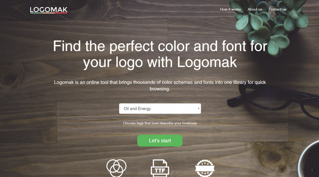
Logomak Landing Page
Suggestion in 123
First, select one of the pre-defined branches from a drop-down list. Right below that list, you’ll find an area where you get to pick the most important characteristics of the brand that the logo is supposed to be for. As these are very generic, like speed, professionality, and so on, you shouldn’t expect too much influence from this selection. After a click on “Let’s Start”, Logomak starts showing you different suggestions.
First, it displays the colors that seem to be the most suitable for the respective branch. Here, the service suggests three dominant colors, all of which can be altered manually. Beneath the suggestions, you’ll find the according color schemes, which contain the respective dominant color.
Lower on the page, enter the name of the business or brand that the logo is meant for. Here, I chose “Dr. Web Magazin”, which is our German language sister magazine. As soon as you start writing, the service pumps out suggestions in different fonts below the input field. These suggestions drag on over several pages, allowing you to switch between them using the buttons
next, and prev. Below the text suggestions, Logomak lists real logos from some of the selected branch’s businesses.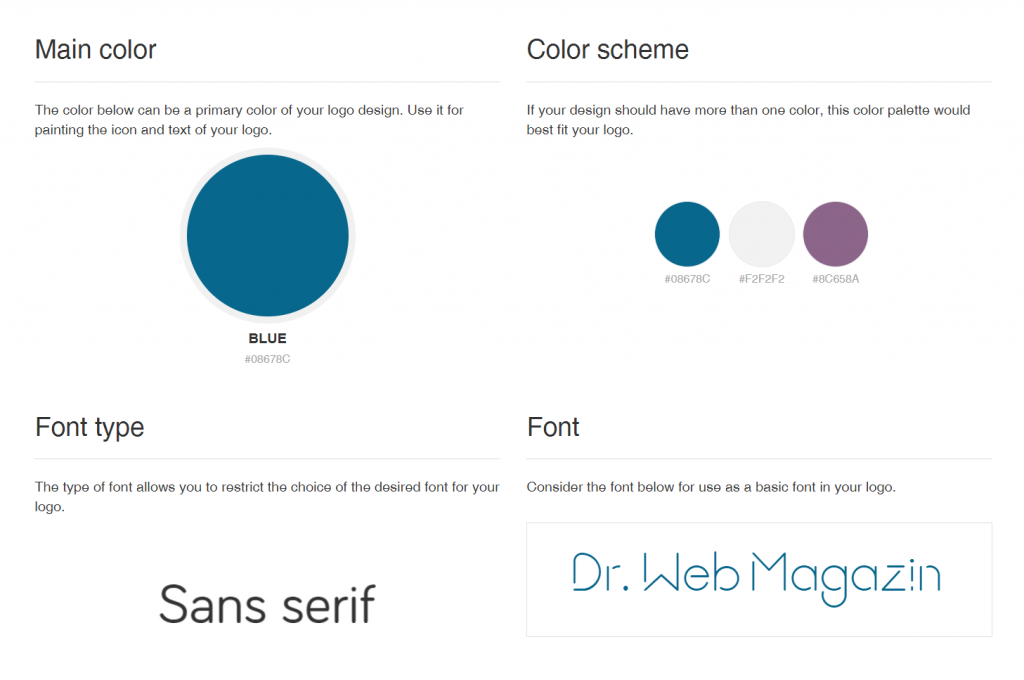
My Suggestion is Complete. (Screenshot: Dr. Web)
Once you’ve selected a color scheme, a window pops up at the lower screen border, displaying your text, and allowing you to choose colors from the scheme. Once you’re satisfied with your selection, click “save”. Now, you’ll receive an overview on all the basic parameters of your planned design, allowing you to tackle the following steps.
Logomak doesn’t provide you with any graphical ideas but limits itself to color and typography. I don’t know what you think about that, but to me, this is helping me without restricting me at the same time.
post on LinkedIn

is getting some major support from tech billionaires to create real social movements.
LinkedIn co-founder Reid Hoffman is leading a $30 million funding round for the site in what he said in a post on LinkedIn was his largest personal impact investment to date.
Bill Gates and Y Combinator's Sam Altman are also investing in Change.org in this round, Change.org CEO Ben Rattray said in a blog post.
"As a society, we should be doing everything we can to build powerful, easy-to-use civic spaces where upstarts and idealists can effectively challenge entrenched interests. Where people believe their participation makes a real difference. Where every day, in transparent fashion, individual citizens can join forces in highly democratic efforts to make the world a better place," Hoffman wrote in his LinkedIn post. "That's why I'm making this investment in Change.org."
The site, founded in 2007, lets users create and sign petitions and advocate for causes ranging from clemency for people convicted of nonviolent offenses to developing a new constitution in Mexico City — two campaigns Hoffman called out in his post.
Change.org has raised $42 million in its 10-year history, including a $25 million Series C funding round in 2014. Gates, Hoffman, and Altman all invested in that round, as did Arianna Huffington, Ashton Kutcher, Twitter's Ev Williams, Richard Branson, and Nas.
The $30 million investment this time around will be used to turn Change.org's monopoly on online petitions into support for real social and political movements and to expand the site's crowdfunding and monthly membership features.
Crisis Text Line founder Nancy Lublin, LinkedIn co-founder Allen Blue, InnerSpace and Flixster founder Joe Greenstein and entrepreneur Sara Imbach will serve on Change.org's board.
Hoffman said he will donate any increase in equity value that he gains from this investment to nonprofits, including Change.org's own charitable foundation.
"Our aim in the years ahead will be to design the type of scalable, sustainable technology that will channel this energy into ever-more effective, constructive action," Rattray wrote. "In doing so, we hope to help create the world most people want — a world in which no one is powerless, and where the policies of governments and practices of business reflect the public good rather than private interests."
الاشتراك في:
التعليقات (Atom)